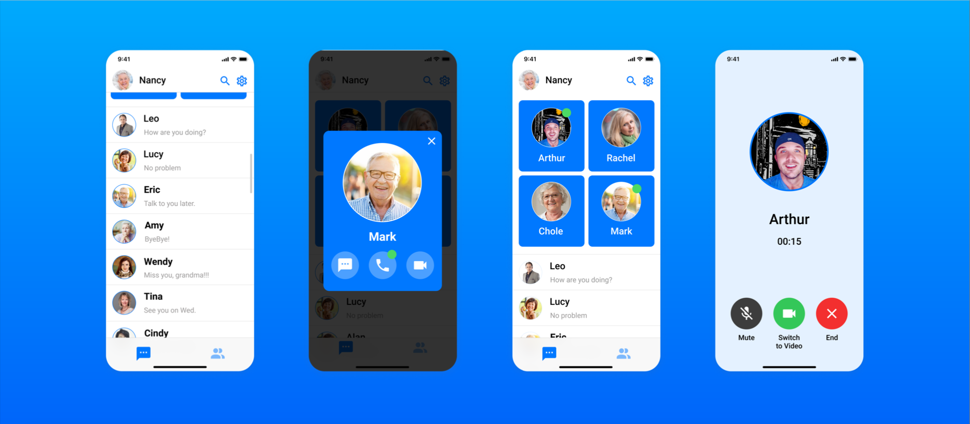
Redesign Facebook Messenger to provide social applications with a barrier-free experience for the elderly.
UI/ UX Designer
3 weeks
Figma
Miro
User Research
Visual Design UX Design
Wireframe
Prototyping
Project Overview
Facebook Messenger is a very popular social app, but its interface design is not suitable for the elderly, especially the homepage and video call pages.
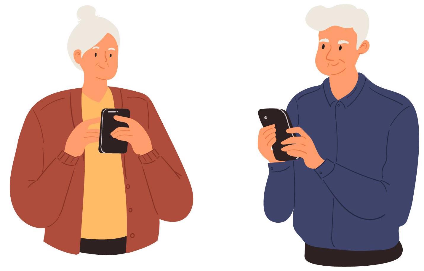
How might we improve the experience of Facebook Messenger to make it more user-friendly for older adults?
Redesign Facebook Messenger's homepage and video calls to make it more minimalist.
The goal of redesigning FB Messenger is to accommodate older users' reading habits and chatting styles, allowing them to quickly and easily find family or friends for texting or video calling.
Research
🌟 The popular social-networking APPs on the market is specially designed for young people, and the user experience for the elderly was neglected.
According to Statista, "50% of people over 65 use Facebook Messenger" in the U.S. I did a short user interview:
With 10 Facebook Messenger elderly users, 7 of them were saying:
"I like to use FB Messenger, but the font size is too small."
"There are some features of FB Messenger that I can't use, it would be nice if it could be simpler"
"I wish I could find the closest people faster"
User Research
I've targeted people 65 and older who use Facebook Messenger to send messages every day, and conducted 10 one-on-one interviews.
Based on research insights and user interview results, I summarized several functions on messenger that elderly users want to improve:
1. Quickly find recent contact
2. Reducing the content on the home screen
3. Increasing the size of fonts and icons
3. Hard to reach the phone call and video call button on the top right corner with the thumb
The general trend is that users are most concerned about convenience and ease of use.
If you are interested in my whole design, please press the button to see the final prototype. 👉
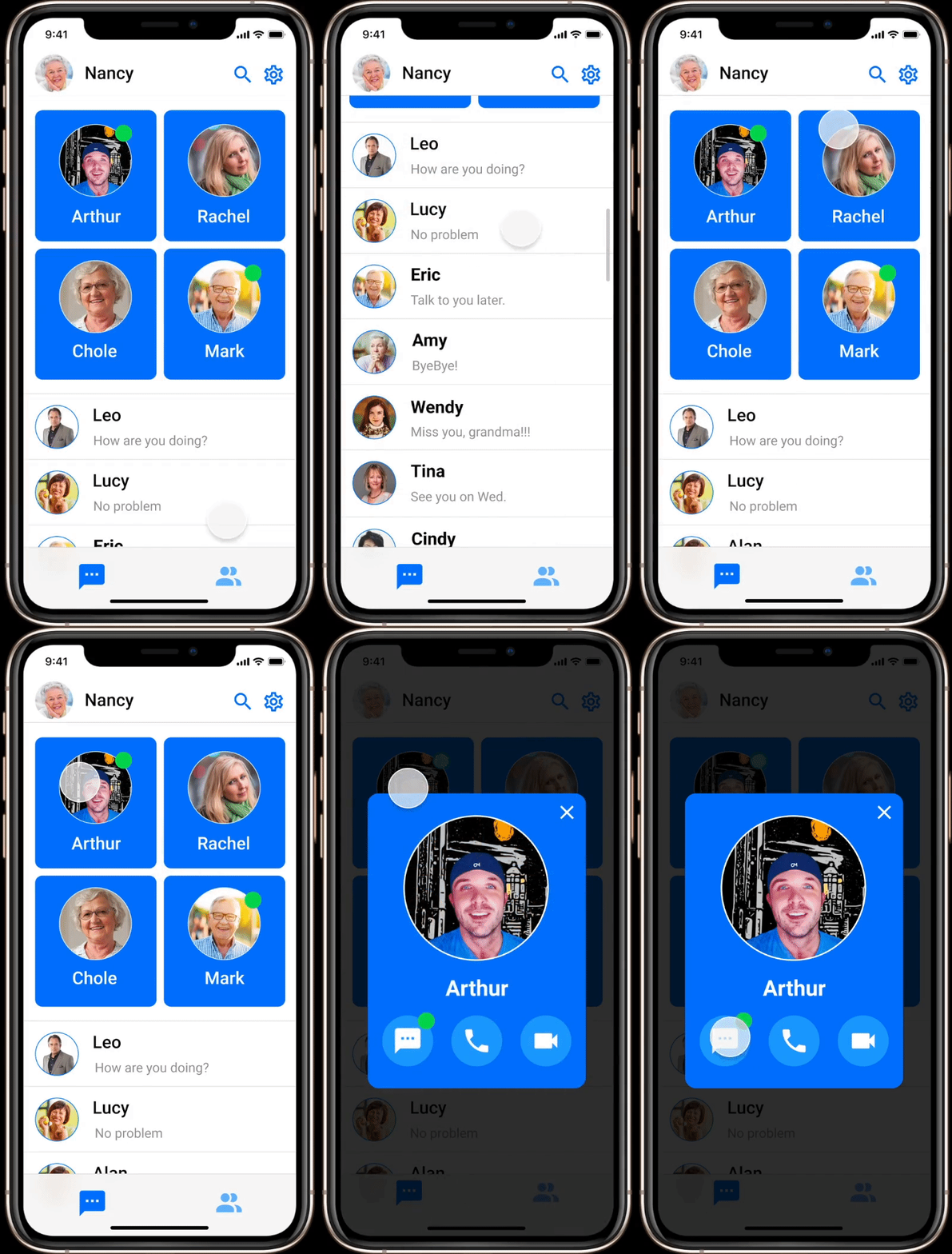
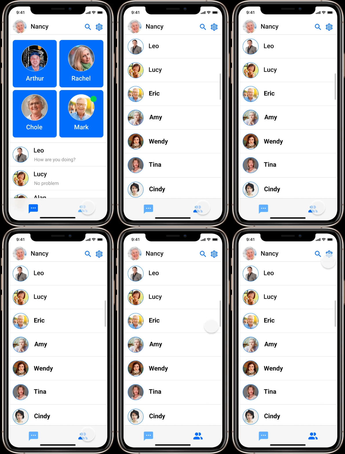
Users did not use some complex homepage functions very often, so zooming in on the personal cards of recent contacts makes them spend less time finding their family/friends.
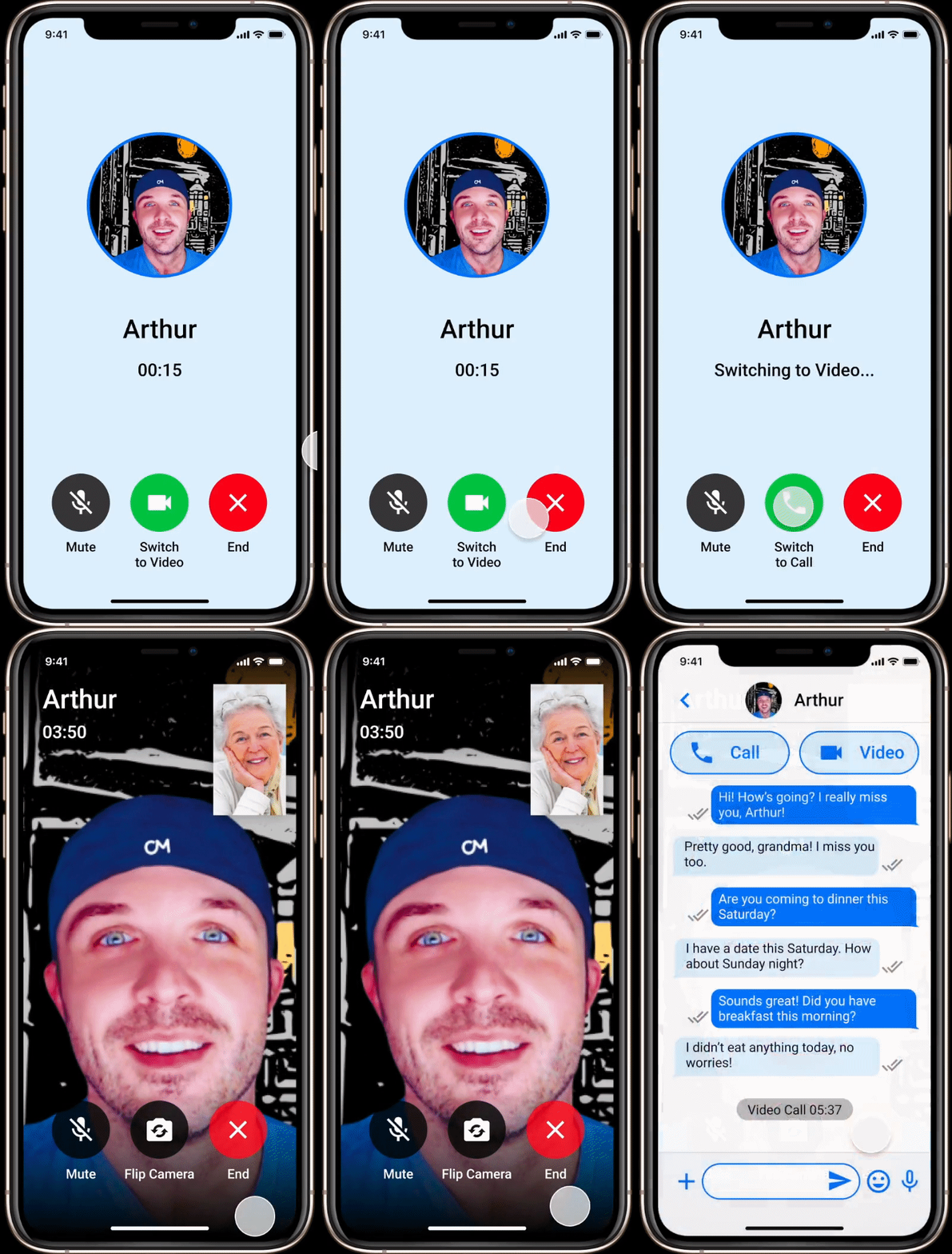
To most users concerns, they need a bigger buttons of call and video, so redesign these two parts on the chat page to make it easier for users to find.
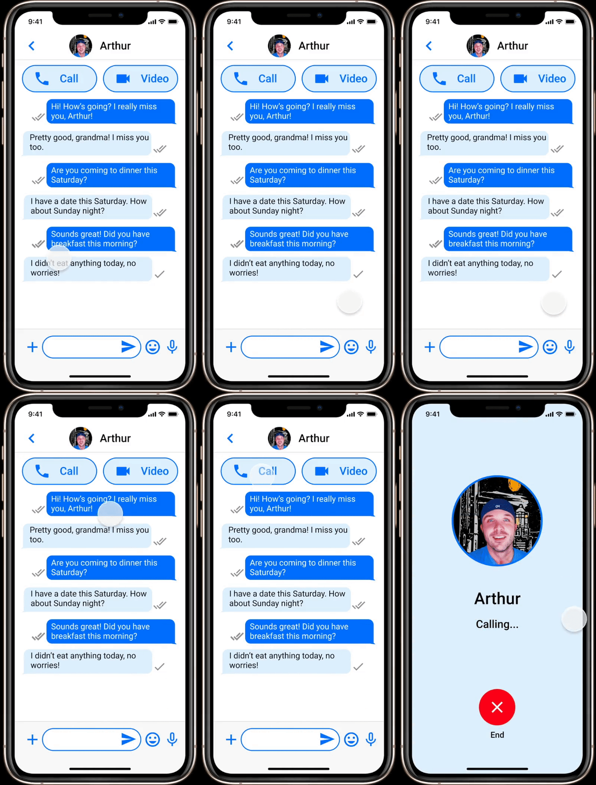
Some users didn't quite understand the meaning of some icons in the call page, so I redesigned three buttons that are commonly used by them, and marked them with text below.
As users pointed out in interview, they felt that the font size of the Find Contacts page was too small and mentioned the features of stories that were not used very often, so I redesigned the avatar and contacts to be larger.
8 out of 10 users respondents said they prefer concise pages.
6 out of 8 users said they became more comfortable using the FB Messenger.
I think keeping the design clean and highlighting the features that users need most is the significant thing in the whole design process, because older adult use the APP quite differently than younger users. With this group in mind, I removed a lot of unnecessary features to keep the overall clean, uncluttered and minimalist to make it more inclusive.